
If you are trying to browse a large product directory from a phone, the main question is not simply whether the page loads. The litbuy Spreadsheet website mobile version needs to make search, product comparison, images, measurements, and sourcing details easy to review on a small screen. A web-based catalog can be much more practical than scrolling through a wide spreadsheet, but the experience still depends on how you search and what information you need to inspect.
This guide looks at the mobile experience from a practical sourcing perspective: what works well on a phone, where a desktop remains more convenient, how to review QC images and measurements, and how international shoppers can move from discovery to an external ordering platform without losing important details.
Smart Search Tip: Looking for more? To find items instantly, use single-word keywords (e.g., “SHOES” or “T-SHIRT”) instead of long sentences for the best results.
Table of Contents
- Is the Mobile Version Easy to Use?
- How to Search Efficiently on a Phone
- What to Check on a Small Screen
- Can QC Photos Be Reviewed Properly on Mobile?
- Measurements Matter More Than Size Labels
- Mobile vs Desktop: Which Is Better for Each Task?
- What International Buyers Should Check Before Ordering
- A Practical Mobile-to-Order Workflow
- Mobile Experience FAQ
Is the Mobile Version Easy to Use?
For basic product discovery, a web-based Litbuy catalog is generally more convenient on a phone than a traditional wide spreadsheet. The reason is straightforward: product information can be presented as individual catalog entries rather than requiring the user to constantly move horizontally across columns.
That difference becomes noticeable when you are browsing while commuting, comparing products from several categories, or checking a product link someone has shared with you. A phone is well suited to quick searches and visual browsing. It is less suited to keeping several detailed specifications visible at the same time.
The practical answer is therefore yes for discovery and routine checking, with some limitations for detailed comparison. If you only want to find a product, open its images, inspect the available information, and save or follow the sourcing link, mobile browsing can be efficient. If you are comparing measurements across multiple listings or studying a large number of QC images simultaneously, a larger screen remains preferable.
The litbuy spreadsheet catalog format is particularly useful here because the browsing experience is designed around product pages rather than requiring every visitor to work inside a large spreadsheet interface.

How to Search Efficiently on a Phone
Mobile browsing becomes much easier when the search term is short and specific. Long natural-language searches can make product discovery slower because product directories are generally organized around names, categories, brands, and short descriptors.
Suppose you are looking for footwear. A short search such as SHOES gives you a useful starting point. You can then narrow the results by inspecting individual product pages instead of trying to describe the exact item in a sentence.
The same approach works for clothing. Terms such as JACKET, HOODIE, JEANS, or TSHIRT can be more practical starting points than a detailed query containing color, fit, material, and brand all at once.
On a phone, this matters because every additional search refinement can require more scrolling and typing. A two-stage workflow is often faster:
- Search using a short category or product keyword.
- Scan the visual results for promising listings.
- Open only the products that appear relevant.
- Review measurements, images, descriptions, and sourcing information.
- Keep the strongest candidates for a closer comparison.
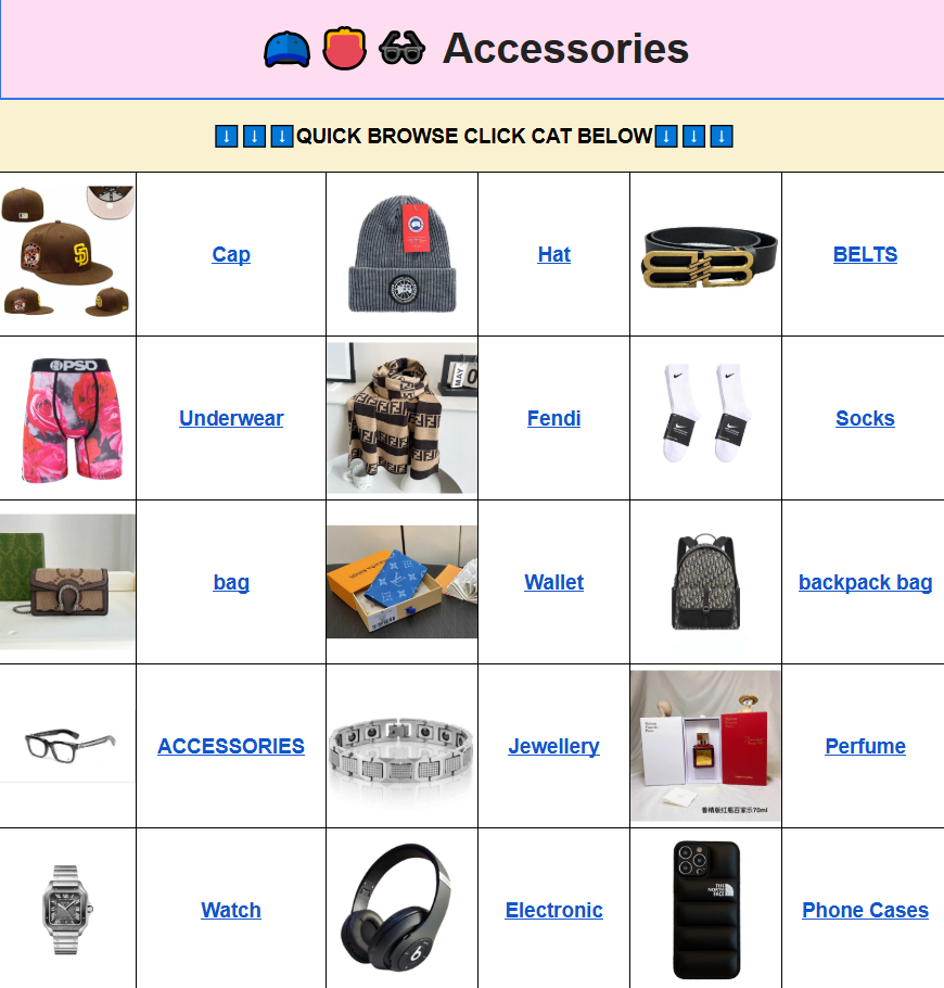
If you are specifically browsing clothing rather than searching across the entire catalog, the litbuy spreadsheet T-shirts category can reduce unnecessary scrolling by taking you directly into a more focused product group.
What to Check on a Small Screen
A mobile product page should be treated as a screening tool first. Do not assume that seeing an attractive product image is enough to make a purchase decision. The important information is usually distributed across several parts of the listing.
Start with the product photographs. Look for enough views to understand the overall shape, major design details, and visible construction. Then check whatever measurements or specifications are provided. Finally, review the available sourcing information before deciding whether the listing deserves further investigation.
| Information | Mobile Check | Why It Matters |
|---|---|---|
| Product images | Zoom into important details | Helps identify visible construction or design issues |
| Measurements | Record key dimensions | Reduces dependence on generic size labels |
| Product description | Read specifications carefully | Can reveal available options and product details |
| QC information | Inspect every useful angle | Provides visual evidence of the received item where available |
| Sourcing link | Confirm it is available before ordering | Prevents confusion when moving to an external platform |
One useful habit is to avoid making a decision while looking at only the first image. Mobile interfaces encourage quick scrolling, and that can cause shoppers to overlook a measurement chart, secondary photograph, color option, or other specification farther down the page.
Can QC Photos Be Reviewed Properly on Mobile?
Yes, but a phone screen has an obvious limitation: small details are harder to compare when the image is displayed at a reduced size. QC photographs can help you evaluate visible characteristics, but they should be treated as visual evidence rather than a complete technical inspection.
For clothing, useful checks include visible stitching, print alignment, overall shape, color consistency, tags, labels, and obvious defects. For footwear, examine the visible sole construction, panel alignment, stitching, shape, and other externally visible details. Accessories may require attention to hardware, zippers, symmetry, engraving or printed elements, and packaging condition.
QC photographs cannot reliably establish everything about a product. A photograph generally cannot prove long-term durability, exact fabric composition, chemical composition, future comfort, or how an item will perform after extended use.
On mobile, zooming is especially useful for one specific reason: it lets you distinguish between a genuinely visible issue and an artifact caused by image compression or lighting. If a detail matters to your decision, inspect more than one photograph when available.
A practical QC checklist for phone users is:
- Check the overall shape before zooming into small details.
- Compare left and right sides where symmetry matters.
- Look closely at stitching, seams, and visible construction.
- Inspect graphics or prints for obvious alignment problems.
- Check hardware, zippers, and closures on applicable products.
- Compare the photographed color with other available views.
- Look for obvious damage, stains, loose threads, or deformation.
If the image is too small to answer an important question, do not treat uncertainty as confirmation. The safer approach is to look for additional information or ask the relevant ordering platform about what inspection information is available.
Measurements Matter More Than Size Labels
Mobile shopping makes one common sizing mistake even easier: selecting an item because the listing says M, L, or XL without checking actual dimensions.
Size labels are not universal. Different manufacturers and product batches can use different measurements for the same nominal size. For clothing, useful measurements may include chest width, garment length, shoulder width, sleeve length, waist, and hip measurements. For footwear, foot length and insole length can be more useful than relying only on US, UK, or EU size labels.
When a measurement chart is available, compare it against a garment or pair of shoes you already own. Measure the existing item using the same method shown by the seller whenever possible.
| Product Type | Useful Measurements | Mobile Shopping Check |
|---|---|---|
| T-shirts and hoodies | Chest, shoulder, length, sleeve | Compare with a similar garment you own |
| Pants and jeans | Waist, hip, rise, inseam, leg opening | Check the measuring method before comparing |
| Jackets | Chest, shoulder, sleeve, length | Allow for intended layering and fit |
| Shoes | Foot length, insole length, width where available | Do not convert sizes without checking measurements |
| Accessories | Dimensions, circumference, weight where provided | Check whether the listed dimensions match intended use |
For mobile users, it can help to copy important measurements into a note before switching between several product pages. That avoids repeatedly reopening the same listing just to check one number.
Mobile vs Desktop: Which Is Better for Each Task?
The best device depends on what you are doing. There is little reason to use a desktop for a quick five-minute search, while there is equally little reason to force a detailed multi-product comparison onto a small phone screen.
| Task | Phone | Desktop or Laptop |
|---|---|---|
| Quick product search | Very practical | Convenient |
| Browsing category images | Very practical | Very practical |
| Reading a single product page | Practical | More comfortable |
| Comparing many measurements | Less convenient | Better |
| Inspecting many QC images | Good for individual checks | Better for side-by-side review |
| Managing multiple browser tabs | Less convenient | Better |
This makes the mobile version particularly suitable for discovery, shortlisting, and individual product checks. A larger screen becomes more valuable when you have reached the comparison stage.
Think of the two devices as serving different stages rather than asking which one is universally better. You can discover products on your phone, save a short list, and later use a laptop when you need to compare several specifications at once.
What International Buyers Should Check Before Ordering
Mobile usability is only one part of the purchasing process. Once you move from product discovery to an external shopping agent or ordering platform, additional information becomes important.
First, confirm that the product and sourcing link you selected are still available. Product directories can contain large amounts of information, but availability can change. Do not assume that a listing remains active simply because it appears in a catalog.
Next, review the destination-specific shipping options offered by the ordering platform. Shipping methods, delivery times, customs procedures, VAT or GST treatment, and carrier availability vary between countries and can also vary according to the type, weight, and dimensions of a parcel.
For shoppers in the US, Canada, UK, EU countries, Australia, New Zealand, and other destinations, the sensible approach is to check the current rules for the actual destination before paying for international shipping. Do not rely on an old shipping estimate or a rule copied from another country.
For EU shipments, for example, the relevant tax and customs treatment can depend on the shipment structure and the service selected. In Australia and New Zealand, GST and import requirements may also differ from European arrangements. Biosecurity restrictions can matter for particular goods or materials.
Where the ordering platform offers DDP or DDU-style options, understand what the quoted service actually includes before selecting it. If the platform does not clearly explain the treatment of duties, taxes, or customs handling, check the current destination guidance rather than assuming that the shipping price covers every possible charge.
A Practical Mobile-to-Order Workflow
A simple workflow reduces the risk of making a rushed decision on a small screen. The following sequence works well for most catalog-based product research:
- Start with a short keyword. Use a category or product term rather than a long sentence.
- Scan visual results. Ignore weak matches and open only promising listings.
- Read the product information. Check measurements, options, and available sourcing details.
- Inspect QC information. Zoom into photographs where construction or visible defects matter.
- Compare dimensions. Use actual measurements instead of assuming your normal retail size will transfer directly.
- Shortlist the strongest options. Keep notes if you are comparing several products.
- Move to the external ordering platform. Confirm the product link and available purchasing information.
- Review shipping before payment. Check destination, parcel information, available routes, and the applicable terms.
The important distinction is between product discovery and purchase completion. The catalog is useful for finding and evaluating sourcing information, while the external ordering platform handles the transaction. Keeping those roles separate helps you know where to verify each piece of information.
Mobile Experience FAQ
Is the Litbuy Spreadsheet website easy to use on a phone?
For searching, browsing categories, opening individual listings, and reviewing product images, a web catalog is generally well suited to mobile use. Detailed comparisons are usually easier on a larger screen.
Can I review QC photos on a phone screen?
Yes. A phone is suitable for checking individual photographs and zooming into visible details. For extensive image-by-image comparisons, a laptop or desktop provides more viewing space.
How should I search for items on mobile?
Use short, specific keywords such as a product type or category. This reduces typing and usually makes it easier to scan relevant results before opening individual listings.
Should I trust S, M, L, or XL labels when shopping from my phone?
No. Treat those labels as a starting point only. Compare seller-provided measurements with a garment or product you already own whenever measurements are available.
Is a desktop better than mobile for product comparison?
Usually, yes. A larger screen makes it easier to keep several product pages, measurements, photographs, and notes visible at the same time. Mobile remains convenient for discovery and shortlisting.
Does mobile browsing change international shipping rules?
No. The device you use does not change customs, VAT, GST, shipping, or carrier requirements. Those factors depend on the destination, shipment, product, and ordering service.
Bottom Line: Use Mobile for Discovery, Not Guesswork
The mobile version is most useful when you treat it as a fast product-discovery and screening tool. Short searches, category browsing, product photographs, measurements, and individual QC checks can all be handled comfortably from a phone.
The limitations become clearer when the task turns into detailed comparison. If you are checking several size charts, comparing multiple QC photographs, or keeping numerous product pages open, a larger screen will usually save time.
The safest mobile workflow is therefore simple: search quickly, inspect carefully, verify measurements, review available QC evidence, and confirm shipping information before moving to the external ordering platform. That approach makes a spreadsheet-based product directory much easier to use without treating mobile convenience as a substitute for proper product evaluation.